On Data
The rise of the position of Data Scientist to help wrangle the flood of data that modern businesses generate is a positive, but it only goes so far. The real value is to use the data constructively


This post is going to highlight the difference between data and understanding. The field of Data Science has been around for a lot longer than most people realize, possibly being mentioned for the first time in 1962:
In 1962, John Tukey wrote a paper titled The Future of Data Analysis and described a shift in the world of statistics, saying, “… as I have watched mathematical statistics evolve, I have had cause to wonder and to doubt…I have come to feel that my central interest is in data analysis…” Tukey is referring to the merging of statistics and computers, when computers were first being used to solve mathematical problems and work with statistics, rather than doing the work by hand.1
That said, the last decade has seen the rise of the discipline of data science, formal recognition that there are certain skills in the realm of data processing and interpretation that are valuable to the business. Instead of being a sideline of a business, the rise of the App Economy, SaaS and modern businesses that are awash in data there are now metric tons of tools to ingest, process, and visualize data.
Odds are, where you work there is a “data lake” and plenty of BI (Business Intelligence) applications and tools to allow you to slice and dice the data like a 70’s vintage Hamilton Beach

Hell, there are tons of courses and boot camps to prepare people for the role of data scientist. Udemy, Coursera, Pluralsight, LinkedIn Training, and many more outlets have programs around data science. For a few weeks of time, and a few hundred dollars, you too can be a data scientist!
And as I am in the world that creates tech and IT training, I have sampled several programs. They are in general good, familiarizing people with concepts and expected skills. But they feel somewhat clinical.
Sure, there are many exercises that show how to interpret the analysis and tie it to some scenario. But the emphasis is on the techniques, how to select data, process it, visualize it, and how to report it.
All great skills, but how does one really internalize the lessons that the data is providing you?
And that is the difference between a junior data scientist, and someone who really understands what the data is telling you.
Anomalous Behavior
My first brush with a modern BI tool was in the mid ‘aughts, when my questions to the IT team that managed our BI tool got tired of all the requests I kept making and just gave me access to the tool. And I was a kid in a candy store. I learned what pivot tables are, and how to slice and dice the data, to pare away sheaths of irrelevance to isolate the relevant data, and then extrapolate trends, anomalies, and insights.
Sure, today the tools are more sophisticated, there are widgets that do some of what I used to do manually instantly, and make it stupid simple to make meaningful dashboards, and report ready charts. It is truly a golden time in data processing, and much needed, as the volume of data tossed off by any modern business is still growing exponentially.
While the tools have improved, and data has exploded in volume and granularity, it still requires the insight of the person viewing the data, and that is where a freshly minted “Data Scientist” with their fresh diploma/certificate falls short.
Case in point: As I mentioned earlier, I work making training for IT in general, and a series of our certifications that support key IT roles.
As such, I build training to meet these requirements, and I have access to the consumption, and performance data of the folks who take our training.
And we collect just about everything someone does in their training. Do they watch the videos? Do they open the transcripts of the videos? Do they select the localized languages? Do they do the exercises? Do they strive to earn the gold badges on the summative challenges?
And on, and on.
We also have tools that chew on this data. Tableau is our current tool, and it works pretty well (even if the performance is less than I would expect2), as long as you have access to the data you need, and are able to use the filters to pare away the noise.
It works well, but it doesn’t extract trends, people still are better suited to that task. Therein lies the problem.
Below, see a representation of one panel of a new dashboard3:
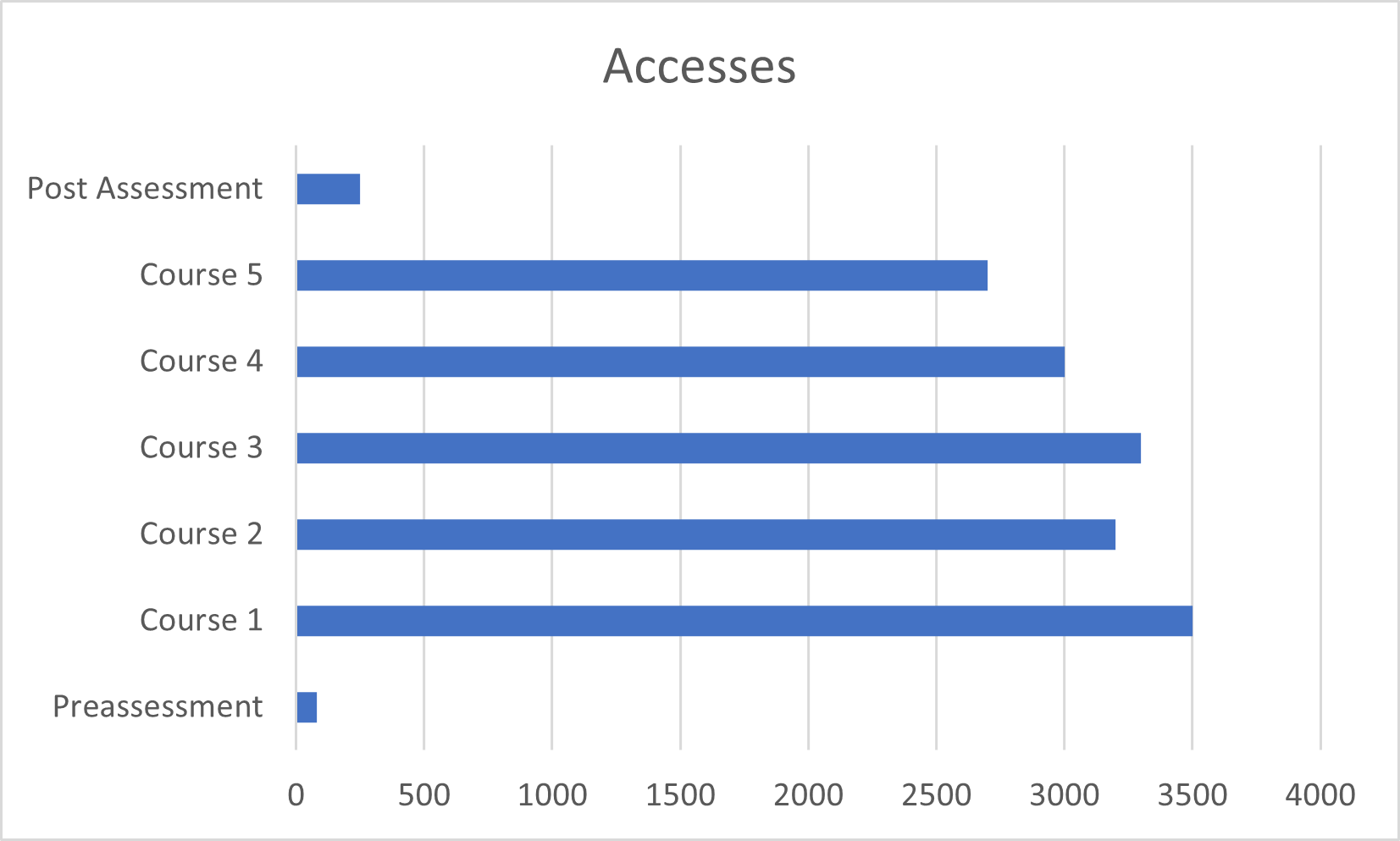
Ignore that it is upside down (forking Excel’s built in graphs) but you can see that as people progress from course to course in the module, that you see some tail off of access. Since this is a new platform, it is not expected that everybody completed every component. No problem there.
But, to “complete” the module, it is required that the student take (and pass) the post assessment. That is what is measured.
The Data team was proud of this, and frankly, I am impressed that they were able to go from our data gathering tools, into the data lake, and then build a custom report in Tableau, to graphically show this in a way that makes sense. And they did it pretty quickly. Now, push a button, and you get that report for any time frame that you care about. Cool.
Huge plus, since I used to have to do this myself, and very very manually.
But the Data team couldn’t connect the dots between what was on the screen, and what was really happening, and how to run an experiment to see if we could encourage more completion via the assessments.
Product Management for the win there. It’s what we do.
I do not want to disparage or discourage the data scientists that are coming up in this era, but instead to get them to question the data, and understand how to connect the data to the business.
One other example was looking at our most active learners. Since we sell a subscription to our entire library for a flat rate, it is a valid data point to see who is consuming the most.
The chart showed that for one user account (tied to an email) that in the previous 90 days, that person logged nearly 860 hours of training time. That is in front of a screen, logged in, and actively partaking.
To me, that screamed that there was a problem. 90 days is roughly 12 weeks. The working hours in 12 weeks is 480, so this “person” logged more than two times the working hours in the period in our system and training.
That is obviously impossible. No job is going to let an employee do nothing but train, and then pay overtime for more training. Instead, this was a case of account sharing, and abuse of our terms of service.
Again, as a product manager, this jumped out at me from the screen, and was missed by our data team.
In fact, much of my data exploration is to identify anomalies like these, or trends, and then to figure out how/why, and if they are good, or bad for our business, to then course correct to improve performance. A data science certificate and skills get you in the ballpark, but if you want to excel, and to create huge value to the business, you need to learn to connect the dots, and to identify insights that can be used to fine tune the performance of the products or services offered.
You are part way there, now learn the rest!
I complain about the performance because it takes eons to have filters take effect. But, I guess that the performance has become important to our execs so this weekend, they are moving it from a VM to a pretty impressive physical server. I hope that reduces the tens of minutes to create a cross tab to something less than a minute to craft a 40k line CSV file for output ↩
Needless to say, this isn’t the actual data, but a stylized example. ↩