UX Observations
Lessons for product management can be found everywhere. Even in a fountain drink machine at a fast-food outlet.

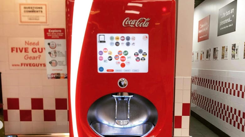
During a calorie laden splurge for lunch, I stopped in at the local Five Guys franchise. While waiting for my grilled gut-bomb (which was delicious) I watched the Coke Freestyle machine. It was an illuminating experience.
The machines weren’t new to me, having seen a couple in the past, I figured out what I wanted, poured it into my cup and moved on. However, since this fine establishment was a bit busy, and my food took about 10 minutes to arrive, I put on my UI research hat and watched people interact with the machine.
I observed that there were three distinct classes of users:
Pro tip: Use your daily activities to practice your spidey Product Management senses
- The expert – whether they had seen it before, or just intuitively knew what to do, they quickly navigated the array of choices into finding what they want, and dispensed their soda. Time spent: < 15 seconds.
- The newbie – this person seemed comfortable with the machine (touch interface, stylistic icons, and the workflow), but they had to navigate a lot to find what they wanted. Sugar or not, which flavor/brand, oh you want Coke? Classic, zero, or diet? did you want cherry or vanilla, or both? It is a dizzying array of choices, and for these people the old soda stand with 4 or 5 dispensers would be a better fit. They spent about a minute figuring out what they wanted before dispensing.
The clueless – I almost hate to call these people non-digital natives. They weren’t “older” (or always older), but you could tell that they just didn’t get the technology. The touch screen interface assumes that you know to reach out and touch it, it doesn’t tell you to start by touching it. Yes there are navigation clues, but unless you live in an iOS world, you might miss them. In short, these people were overwhelmed by the technological prowess on display. More than a few of these people needed the next person in line to guide them through the process.
This reminds me that when I work to define the user interaction model with my products, that there are use cases that should not be dismissed. The likelihood of turning away a less sophisticated user is quite high, so balancing complexity and capability is a necessary exercise.
For a product to be successful, it must be broadly approachable, and that means designing to fit novices and experts alike, with seamless transitions in operating modes.
(I highly recommend you read the Wikipedia article linked above. The technology and implementation of these machines is truly awesome.)


